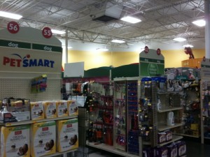
We recently got a puppy for our girls, and so we’ve been spending some time at PetSmart. I’m not overly familiar with the layout of the store, and it’s a big place, so signage is important. PetSmart fails badly.
They get the big layout right — large sections, color coded by pet, so you know where to go first. Good start. I see the giant green “DOG” sign and head that way. Once I’m in there, I see a bunch of aisles with green signs, so I start looking for the one that would have something to do with training pads for the puppy to pee on. The end caps all have nice large signs that say “dog”. All of them. There’s probably 20 aisles of dog stuff, with signs on both ends, so that’s 40 “dog” signs and nothing that really helps. Here’s a pic I grabbed:
If you look down the aisle, they have a few signs that kind of stick out, but they don’t help very much. I’m already in the very clearly defined “dog” section, so why not use those endcaps to give more detailed information. I’m thinking supermarket style would work best, with a short list of the main items in that aisle (“food”, “toys”, “leashes”, etc).
All in all, this seemed very poorly thought out.


