mickmel
  • Blog
  • About
    • Tools
  • Speaking
  • Podcast
  • Contact
  • Search

When creativity helps the most

November 2, 2023 by greenmellen Leave a Comment

Reading Time: < 1 minute

Creativity can be a double-edged sword. While it’s often a very good thing, if used excessively or carelessly it can lead to trouble. As David Ogilvy has said:

“When I write an advertisement, I don’t want you to tell me that you find it ‘creative.’ I want you to find it so interesting that you buy the product.”

This came up when I saw the “Bay Area Deathfest” promotion (a death metal festival in San Francisco). All death metal bands have almost indistinguishable logos; as Creative Bloq says, “Generally, they’re a veritable smorgasbord of tattoo-ready spikes and gothic typography – the harder to read, the better.“.

I said “all of the bands”, but there was one exception that you might notice…

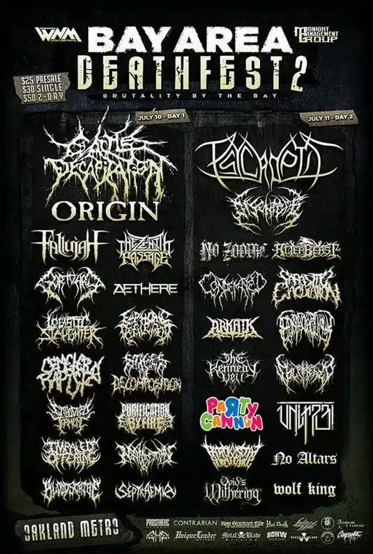
While being creative for creativity’s sake can be bad, there are times when a bit of “let’s just try to stand out” can be a good thing. As user “JosebaZilarte” mentioned on Reddit, “For a music genre that presents itself as subversive, there is a lot of conformism.“

It seems to me that pretty much every death metal band has found a logo designer and said “we need a logo that looks like this”, and they all got it. It’s generally important to stay close to your genre so that you can be easily identified, but when that goes too far it leaves a great opportunity for someone else to stand out.

Filed Under: Design

Design is how it works

October 30, 2023 by greenmellen Leave a Comment

Reading Time: < 1 minute

Good design can be hard to notice. Not because it’s so beautiful or creative, but because of how well it makes things work. A well-designed product is ideally beautiful and creative, but the true design comes from the function of it.

In an article in the New York Times 20 years ago, just after the release of the first iPod, Steve Jobs put it this way:

”Most people make the mistake of thinking design is what it looks like,” says Steve Jobs, Apple’s C.E.O. ”People think it’s this veneer — that the designers are handed this box and told, ‘Make it look good!’ That’s not what we think design is. It’s not just what it looks like and feels like. Design is how it works.”

The iPod was indeed a great example of that. It was a slick and good-looking device, but the function of it was far beyond any other MP3 players of the time — and it wasn’t even close.

Apple has done this as well as any company in history, but it’s worth remembering for our own work. Make it beautiful, make it creative, but make sure it works as smoothly as it possibly can.

Filed Under: Design, Technology

No one will be there to explain it to the customer

October 25, 2023 by greenmellen Leave a Comment

Reading Time: < 1 minute

When it comes to design and marketing, being able to explain and justify your decisions is a good thing. You shouldn’t be creating anything that just “looks nice”, and everything should have a purpose. At the end of the day, though, you’re not going to be able to explain things to your end user — they’ll need to be able to understand on their own.

This is something that Steve Jobs was famous for doing. Once in a meeting, where he was going to be shown an upcoming commercial that Apple was going to run, the staff wanted to explain what they were trying to do with the ad. Steve refused and just wanted to see it without context, because that’s how their users were going to see it.

For something like your website, users need to be able to understand how to use it without any instruction. You should be able to explain your design decisions to your boss or client, but the user is going to visit the site without any context and it needs to work for them.

Whatever you’re building, think of the state of the user that will be interacting with it and keep it as simple as possible.

Filed Under: Design

Design isn’t veneer

October 11, 2023 by greenmellen Leave a Comment

Reading Time: < 1 minute

Design is a tricky thing, and it’s often misunderstood. Most people think of design in terms of “beautiful colors”, but design is less about how something looks and more about how people respond to it.

As he often does, Steve Jobs put it perfectly:

“In most people’s vocabularies, design means veneer. It’s interior decorating. It’s the fabric of the curtains and the sofa. But to me, nothing could be further from the meaning of design. Design is the fundamental soul of a man-made creation that ends up expressing itself in successive outer layers of the product or service.”

If done well, as Don Norman has said, it’s hard to notice. Good design just works, while bad design sticks out. Or, like David Ogilvy famously said:

“When I write an advertisement, I don’t want you to tell me that you find it ‘creative.’ I want you to find it so interesting that you buy the product.”

Creativity and beautiful design are wonderful things, and we strive to build websites that look amazing. Above that, though, we always try to make sure that design achieves the goals we’ve laid out, so that “creative” and “beautiful” are just icing on the cake.

Filed Under: Design

Is it clever or self-indulgent?

September 16, 2023 by greenmellen Leave a Comment

Reading Time: < 1 minute

There is a fine line between a design that is clever and one that is self-indulgent, and they often fall to the latter. As Don Norman said in “The Design of Everyday Things“:

“Rule of thumb: if you think something is clever and sophisticated beware-it is probably self-indulgence.”

Ultimately, though, it doesn’t really matter which it is. Most designs that are clever fail to achieve what they were meant to do. Also from Don’s book:

“The design of everyday things is in great danger of becoming the design of superfluous, overloaded, unnecessary things.”

When building something, good design is intentionally hard to notice. There are places where a clever design can help, but clever usually is the opposite of beneficial. Being clever simply for the sake of standing out is of no value to anyone but the designer.

Filed Under: Design

Good design is hard to notice

September 6, 2023 by greenmellen Leave a Comment

Reading Time: < 1 minute

A few days ago I shared the concept of Norman Doors, which are doors that can be confusing to open. When you come across a typical door and push the flat plate to open it, it just works and you don’t really notice it. However, when you come to a door with a handle on it to pull (but you were supposed to push instead), you notice right away.

This is true for most kinds of design. In “The Design of Everyday Things“, author Don Norman puts it this way:

Good design is actually a lot harder to notice than poor design, in part because good designs fit our needs so well that the design is invisible, serving us without drawing attention to itself. Bad design, on the other hand, screams out its inadequacies, making itself very noticeable.

This applies to menus in restaurants (“why is the font is so hard to read?”), website design (“where on earth is the contact information?”) and even things like flashlights (“how do I turn it on?”).

Good design blends in and does its job, whereas bad design stands out. In a way, it’s kind of like the IT department at your company; they only are noticed (and appreciated?) when things are going sideways.

If you’re a designer and people don’t comment on your work too often, that might be a very good thing.

Filed Under: Design

Norman Doors are everywhere

September 4, 2023 by greenmellen Leave a Comment

Reading Time: < 1 minute

I recently finished reading Don Norman’s excellent “The Design of Everyday Things“, and I highly recommend it. He mentions in the book something I’ve heard about a bit before that he coined decades ago call “Norman Doors”. As he explains:

Somehow, when a device as simple as a door has to have a sign telling you whether to pull, push, or slide, then it is a failure, poorly designed.

When you approach a door, it shouldn’t need a “push” or “pull” sign on it. If it has a handle to grasp, expect to pull. If he has a flat bar or plate, expect to push. As you’ve undoubtedly seen hundreds of times, this is often not the case.

In an article about this a few years ago, 99% Invisible shared this excellent example:

His book goes far beyond doors into pointing out ways that so many other things in life could be designed in better ways.

Some things have improved greatly, such as the ease of cell phone use after the iPhone came out in 2007, and some are still lacking, like the ability to set the correct time of day on many appliances in the kitchen.

The book is excellent, and will really open your eyes to the world around you. More posts from it will be here in the coming days, and I strongly encourage you to add it to your reading list.

Filed Under: Design

The magic is in the mundane

August 29, 2023 by greenmellen Leave a Comment

Reading Time: 2 minutes

Apple tends to do something very special with their products that other companies miss — they get the tiny details perfect. I disagree with some of their larger features and goals, but when they do something, they do it right.

Going all the way back to the Apple II, Steve Jobs insisted that the chips on the motherboard be lined up perfectly, even though they weren’t going to be seen by anyone. For things that would be seen, Jobs was even more precise.

In the book “Inside Steve’s Brain“, a few more anecdotes from Jobs were shared. First was how closely he looked at prototype details:

When they showed the working code to Jobs, he’d lean forward, his nose to the screen, and examine them closely, moving from the demo to the prototype and back again. “He would compare them pixel by pixel to see if they matched,” Ratzlaff said. “He was way down into the details. He would scrutinize everything, down to the pixel level.” If they didn’t match, Ratzlaff said, “some engineer would get yelled at.”

Jobs wanted absolute perfection, which made him a tough guy to work for, but produced amazing products. If you’ve studied Jobs much, though, the paragraph above wasn’t too surprising.

What was surprising was what followed. Most computers and phones have scrollbars on them for when there is additional content that doesn’t fit on the screen, and you likely have a scrollbar wrapping around this content right now. Most scrollbars seem pretty simple, but it took Apple six months to get the scrollbars just right for Steve. Again from the book:

Incredibly, Ratzlaff’s team spent six months refining the scrollbars to Jobs’s satisfaction. Scrollbars are an important part of any computer operating system but are hardly the most visible element of the user interface. Nonetheless, Jobs insisted the scrollbars look just so, and Ratzlaff’s team had to design version after version. “It had to be done right,” said Ratzlaff, laughing at the effort that went into such a seemingly minor detail.

Big ideas can be amazing, but the magic is in the details. Working that hard on things like scrollbars seems crazy, and perhaps it was, but that attention to detail in every area is what makes Apple so well-loved.

Filed Under: Design, Technology

People aren’t tennis balls

August 7, 2023 by greenmellen Leave a Comment

Reading Time: 2 minutes

For an official Type 2 tennis ball, which weighs between 1.975 – 2.095 ounces, dropping it from a height of 100 inches should bounce back up between 53-58 inches. If you take the same tennis ball and do the same test, you’re going to get the same result.

People are quite different than that, which makes human-focused design very difficult.

On a recent episode of Guy Kawasaki’s “Remarkable People” podcast, he had Don Norman (author of “The Design of Everyday Things“, among others) on the show. The entire episode was fantastic, but my thoughts on this post come from something Don said on the show.

He said:

And the physical sciences, look if I pick up something and I drop it, and I pick it up again, and I drop it, the fact that I dropped it once before doesn’t change the way it falls a second time.

That’s called path independence. People don’t have that. Whatever I do to you affects what’s going to happen the next instant. And that’s what makes it so hard to design. In fact, I once argued that you can’t ever make the perfect design because if you made the perfect design, people would use it in ways you’d never thought of. And then in those new ways, it wouldn’t be perfect anymore.

There have been thousands (millions?) of examples of this over years, summarized in fun pieces like this:

To me, this is why things like user personas are so important. You’re never going to get a design perfect, so you need to work hard to get it as close to perfect as you can (and keep adjusting to make it “more perfect” over time).

As Michael (Ted Danson) said once in the show “The Good Place”, anything can be up to 104% perfect. While that was just a funny line, it’s a good target and a reminder to keep iterating and improving as time goes on. Users will still find unique ways to break your interface, but the more perfect you can make it, the better.

Filed Under: Design

“Make it darker” is not an acceptable form of feedback

July 7, 2023 by greenmellen Leave a Comment

Reading Time: 2 minutes

Feedback can be a wonderful thing, as I’ve shared many times on here (like “Feedback is a gift“), but only if it’s the right kind of feedback. If someone says “I like it“, that’s not very helpful, because our clients are not the people that we build websites for. Their liking it or not is often irrelevant to the goal of the project.

In his book “The Win Without Pitching Manifesto“, author Blair Enns says it like this:

We welcome the client’s input on the strategy and in exchange we ask him to grant us the freedom to explore various ways of executing it. This means we invite him to say, “That blue isn’t bold enough to deliver on our core value of strength.” But we explain that he is not invited to say, “Make it darker.” Suggestions on this front are always welcome, but dictates are not.

Of course, that puts more work back on us, as it should — we need to be able to defend all of our strategy, content, and design decision with solid reasons for everything, and never with “it just looks better that way”.

Related is something that David Ogilvy shared in his book “Ogilvy on Advertising“:

“When I write an advertisement, I don’t want you to tell me that you find it ‘creative.’ I want you to find it so interesting that you buy the product.”

This is a big part of the reason why our process can’t be sped up; we need to work through every step with the viewpoint of the end user, and that takes time.

If you want to make something darker just because you’d like it better that way, go for it, but backing those ideas with solid reasons on how the change will affect the end user will make everything much more effective.

Filed Under: Content, Design, Websites

  • « Previous Page
  • 1
  • 2
  • 3
  • 4
  • Next Page »
mickmel-white
Facebook LinkedIn Feed Youtube

© 2025 Mickey Mellen. All Rights Reserved.
Accessibility Statement | Privacy Policy