
Reading Time: 2 min Growing up in Michigan in the 90’s, I was a big fan of Barry Sanders. While the Detroit Lions were always the pits, Sanders was fun to watch. If you’ve not seen him play before, you can see some amazing highlights here or check out this quick gif: Along with those great clips, though, I […]
Design
The history of the 72 dpi myth

Reading Time: < 1 min Most designers were taught in school that images for print should be 300 dpi (or “ppi” if you prefer – I use them interchangeably), and images for the web should be 72 dpi. While the print number is accurate in most cases, the web number is completely unnecessary as I explained in detail nearly a […]
Planning saves money

Reading Time: < 1 min When building a website, we always create at least a handful of wireframes so we can sort out what we’re doing before we really dig in. If you’re not familiar with the concept of a wireframe when it comes to websites, Brooke wrote an excellent post that explains them here. Beyond the great reasons that […]
Double your whitespace

Reading Time: < 1 min When you’re developing a marketing piece, whether it’s a brochure, poster, website, or something else, it’s temping to load it up with as much information as you can. I encourage you to think otherwise, and leave a lot more whitespace in there than you think you need. Here are two billboards that give a perfect […]
Don’t break the back button
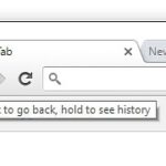
Reading Time: < 1 min Over the years, the “back” button on web browsers has consistently been shown to be one of the most-used features on a web browser. As time as gone on, though, websites have found increasingly creative ways to break that core functionality. The folks at the Baymard Institute have showed four design patterns that violate what […]
Averages or adjustments?
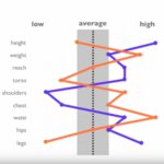
Reading Time: 2 min It can be easy to try to design something to fit “the average person”. But do you want to? Or more importantly, is it even possible? In many cases, an average may not exist. If you’re with a group of people where 50% are Christian and 50% are atheist, it’s not useful to say “the […]
Design everything you do

Reading Time: < 1 min While I would never be considered a designer, I’m always looking for ways to improve how I think about the world around me. I found a great example in an old blog post I was reading (the post is not available, but you can see it using archive.org here) where this concept came up: Design […]
What’s on the back of your cabinet?

Reading Time: 2 min If you were to pull your chest of drawers out from the wall and look at the back of it, what would you see? In most cases, it’s just a piece of plywood or even some heavy cardboard. That’s not necessary bad (cost savings, etc), but it speaks to the quality of the design. Steve […]
The best design is invisible

Reading Time: < 1 min There’s a running joke with I.T. folks that they’re seen as expendable, because people often only see them one of two ways: All systems are running great, so why do we have I.T.? Things are broken, so why do we have I.T.? Similar are sound techs at a concert. They’re completely invisible, and often underappreciated, […]
Johannes Gutenberg was the first Steve Jobs

Reading Time: 2 min In learning more about Johannes Gutenberg and his creation of the printing press, the similarities with Steve Jobs and the first Macintosh are remarkable. Typeface Both men took a serious stance on high-quality typeface (fonts, essentially), at a place in history when it seemingly didn’t matter. Both men created something spectacular and history-changing, yet were […]