mickmel
  • Blog
  • About
    • Tools
  • Speaking
  • Podcast
  • Contact
  • Search

Planning saves money

June 6, 2021 by greenmellen Leave a Comment

Reading Time: < 1 minute

When building a website, we always create at least a handful of wireframes so we can sort out what we’re doing before we really dig in. If you’re not familiar with the concept of a wireframe when it comes to websites, Brooke wrote an excellent post that explains them here.

Beyond the great reasons that she gives for them, though, is that they can save money on your project. There’s an old quote from Frank Lloyd Wright that I love that really speaks well to this:

You can use an eraser on the drafting table or a sledge hammer on the construction site.

If we were to skip the wireframe step of a website and just build it out, changes could certainly still be made later. Those changes are just much more easily made when you’re dragging around empty black boxes instead of a fully-developed website. Plus, it’s hard to just build out pages randomly with out looking at the goal for each page as you sketch out the wireframe.

Speed can be great, but sometimes a bit of preparation will save you more time and money in the long run.

Filed Under: Design, Websites

Double your whitespace

May 22, 2021 by greenmellen Leave a Comment

Reading Time: < 1 minute

When you’re developing a marketing piece, whether it’s a brochure, poster, website, or something else, it’s temping to load it up with as much information as you can. I encourage you to think otherwise, and leave a lot more whitespace in there than you think you need.

Here are two billboards that give a perfect example:

If you’re driving by, which one would tell you more? I think it’s clearly the one that says less. It can be hard to do when you’re marketing, but it’s almost always more effective. Define a clear message and focus on that, rather than trying to provide all of your information right off the bat.

There are a lot of opportunities in your design to add more whitespace and make things clearer. Remove unnecessary buttons. Add more space between menu items. Let things breathe, and share with the user the most important things — they’ll find the details later.

Filed Under: Design

Don’t break the back button

May 20, 2021 by greenmellen Leave a Comment

Reading Time: < 1 minute

Over the years, the “back” button on web browsers has consistently been shown to be one of the most-used features on a web browser. As time as gone on, though, websites have found increasingly creative ways to break that core functionality.

The folks at the Baymard Institute have showed four design patterns that violate what users expect when they press “back”, and their research shows that 59% of websites make these mistakes.

There are simple ways to help with this, such as not having links open in new tabs (which also helps with accessibility), but Baymard’s list goes a lot deeper.

Their list consists of:

  1. Overlays & Lightboxes (37% of sites don’t do this)
  2. Filtering & Sorting (27% of Sites Don’t Do This)
  3. Accordion Checkouts
  4. Returning to the Product List from the Product Page

I encourage you to check out their full article to learn more about each of those and how to keep your site as user-friendly as possible.

Filed Under: Accessibility, Design, Websites

Averages or adjustments?

April 16, 2021 by greenmellen Leave a Comment

Reading Time: 2 minutes

It can be easy to try to design something to fit “the average person”. But do you want to? Or more importantly, is it even possible?

In many cases, an average may not exist. If you’re with a group of people where 50% are Christian and 50% are atheist, it’s not useful to say “the average person in this room sort of believes in God” — none of the people in the room fit that description.

The average pilot

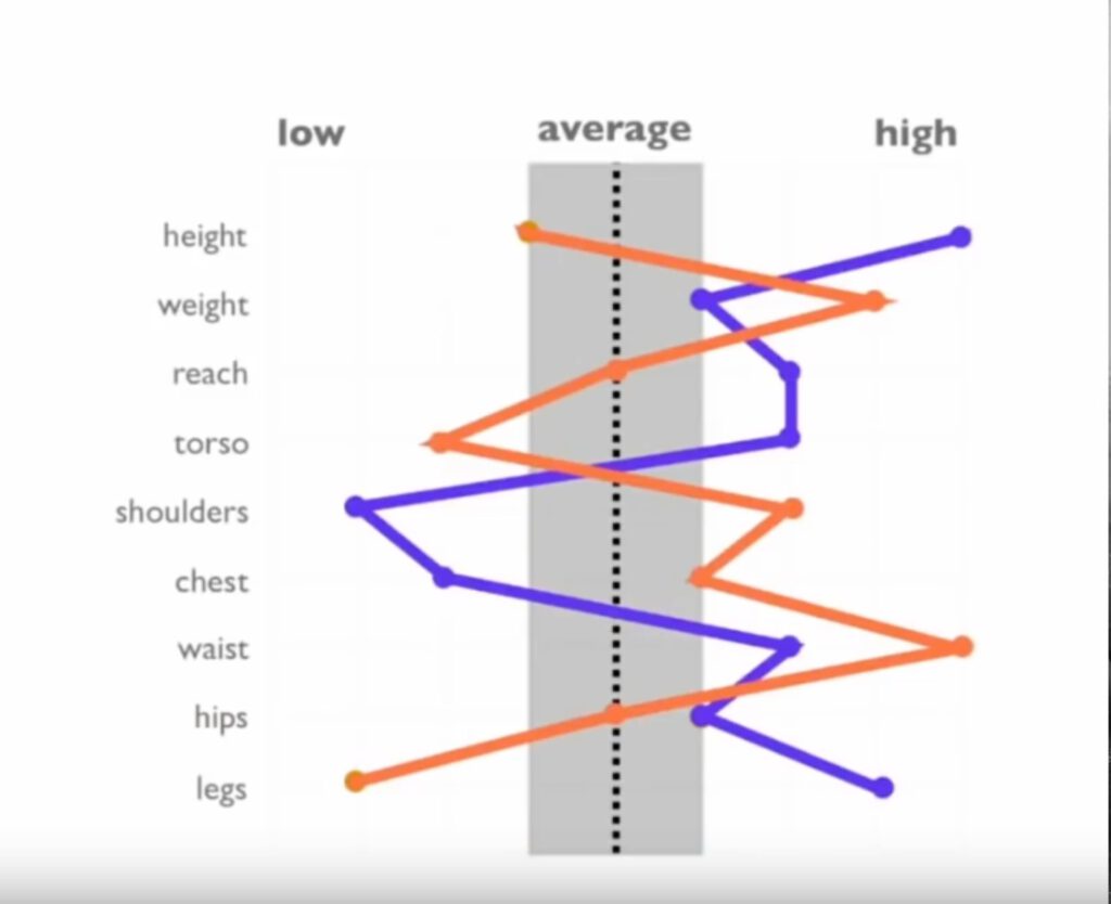
Back in the 1950’s, the U.S. Air Force tried to design a cockpit to fit the average pilot’s body. After measuring 4,000 pilots, they discovered that none of them came close to having an “average” body.

This chart from World War Wings shows what I mean, with the “jagged size profile” of each pilot:

From the article:

But Lt. Gilbert S. Daniels had doubts. He chose to look at each of the 4,000 pilots’ measurements side by side with the average and found a revelation that was shocking for the times. Not a single pilot even came close the measurements of the average.

Averages can work

That’s not to say that all averages are bad. Facebook works to fit the average user, as does Windows, your laptop, the and latest book you read. Trying to completely customize everything would be incredibly inefficient.

Instead of dumping averages completely, working a set of options near the average can be great. You can customize Windows or Facebook to fit your needs, and that’s ultimately what the Air Force did with the introduction of adjustable seats:

While pilots still needed to be within a certain range of dimensions, these new adjustments revolutionized production. The solution was cheap, easy, and better yet, pilot performances soared.

For a bit more, check out this TED Talk that covered this very story:

Filed Under: Design, Technology

Design everything you do

February 26, 2021 by greenmellen Leave a Comment

Reading Time: < 1 minute

While I would never be considered a designer, I’m always looking for ways to improve how I think about the world around me.

I found a great example in an old blog post I was reading (the post is not available, but you can see it using archive.org here) where this concept came up: Design everything you do

buy bactrim online https://iowapsychology.org/wp-content/uploads/backup/2021/04/bactrim.html
buy orlistat

Specifically, they offered the following advice:

During my first internship out of college, Stella Lai gave me this tip and it has been the best professional advice I ever received. Try to practice this tip as literally as possible. The obvious areas are how you dress and how your house/apartment/room is organized. I would suggest not stopping there. Your emails should be written/composed clearly and beautifully. Your conversations with individuals should be designed through how you listen, how you maintain eye contact, how you respond (both spoken and unspoken). Everything you do should have a reason, no matter how small. Design requires constant practice, this is a great way to keep growing. 

The act of continually working on design will help your own approach, but it’ll also help you notice patterns in other places. Observation of the world around you is always wise, and I thought this was a great little tip.

Filed Under: Design

What’s on the back of your cabinet?

February 24, 2021 by greenmellen Leave a Comment

Reading Time: 2 minutes

If you were to pull your chest of drawers out from the wall and look at the back of it, what would you see? In most cases, it’s just a piece of plywood or even some heavy cardboard. That’s not necessary bad (cost savings, etc), but it speaks to the quality of the design.

Steve Jobs put it this way, as told by Michael Schrage in an article on Design Intelligence:

buy amoxil

When you’re a carpenter making a beautiful chest of drawers, you’re not going to use a piece of plywood on the back, even though it faces the wall and nobody will ever see it. You’ll know it’s there, so you’re going to use a beautiful piece of wood on the back. For you to sleep well at night, the aesthetic, the quality, has to be carried all the way through.

Jobs made sure Apple followed a similar philosophy. In the early days of Apple, he insisted that the chips on the motherboard of the Apple II and the original Macintosh be perfectly lined up. His team protested with things like “Nobody is going to see the PC board”, but he insisted. He wanted his products to be beautiful both inside and out.

(fun side note — the device you’re on right now has roughly 4,000,000 times more memory than the Apple II motherboard pictured above)

I don’t think Jobs’ philosophy fits in every situation, but it depends on your goals. If you want to make something truly amazing and beautiful, don’t be afraid to go all the way with it.

Filed Under: Design, Technology

The best design is invisible

February 12, 2021 by greenmellen Leave a Comment

Reading Time: 2 minutes

There’s a running joke with I.T. folks that they’re seen as expendable, because people often only see them one of two ways:

  1. All systems are running great, so why do we have I.T.?
  2. Things are broken, so why do we have I.T.?
doxycycline

Similar are sound techs at a concert. They’re completely invisible, and often underappreciated, unless something goes wrong. It’s a tough place to be.

The same is true of good design when it comes to marketing. If you notice how well something is designed, that’s often a problem because you’re now distracted from the object of the marketing. If you’re dazzled by the cool hover effects on a button, you’re not engaged in the material on the page.

That’s not to say that design should be bad, because that is equally distracting. If you notice how poorly something is designed, that’s a big problem — in fact, it may be a bigger problem because now you’ve again not seen the purpose of the content, but you also have a bad taste in your mouth regarding that company.

The best design always works toward accomplishing a goal. That goal may be to inform, direct to a purchase, gain a sign-up on an email list, or a litany of other things, but the purpose must be there. When we’re building a website, we lay out a goal for every single page of the site and then work to guide visitors toward that goal. This is much easier said than done, which is why I work with professional designers rather than trying to put something together myself. Most of my designs would quickly fall into the “bad” category, despite my best efforts.

If your design looks awesome simply for the sake of looking awesome, it’s very likely that you’ve missed the point.

buy fluoxetine online fluoxetine online

Filed Under: Design, Marketing, Websites

Johannes Gutenberg was the first Steve Jobs

February 8, 2021 by greenmellen Leave a Comment

Reading Time: 2 minutes

In learning more about Johannes Gutenberg and his creation of the printing press, the similarities with Steve Jobs and the first Macintosh are remarkable.

buy

Typeface

Both men took a serious stance on high-quality typeface (fonts, essentially), at a place in history when it seemingly didn’t matter. Both men created something spectacular and history-changing, yet were focused on details like precise serifs and line heights when more basic lettering seemingly would have been just fine.

Perfection Everywhere

It went beyond just typefaces, though. Both men were obsessed with the smallest details of their work. Gutenberg invented new types of ink and pressing equipment, while Jobs created a user interface incredibly simpler than anything that had come before. Jobs continued this throughout his career, doing things like famously throwing an iPod prototype into a fish tank to show it could be made a fraction smaller.

Power to the people

The inventions of both men were in large part to help give a voice to people that otherwise wouldn’t. In the 1400’s, the church had the loudest voice of all, and Gutenberg helped to level that field. In the late 1900’s, Jobs helped usher in the computer revolution, eventually leading to everything we see today.

Failure wasn’t failure

In the end, both men were so obsessed with the perfection of their creation that it led to financial ruin. Jobs recovered, but Gutenberg never did.

But to them, it wasn’t really failure. I’m sure they would have preferred to have been more financially healthy after the creation of their machines, but it was the machines themselves that set them in leagues of their own.

Gutenberg is still everywhere

Amazingly enough, we still see evidence of Gutenberg today. One of the first blogging platforms was Movable Type, which is the style of machine that Gutenberg created. Of course, you also have WordPress, which itself is a nod back in time, and the latest version of their editor is simply known as “Gutenberg“.

To dig deeper into the history of the printing press, Stephen Fry’s look into Gutenberg’s past is one of the best videos I’ve ever seen on the subject, and I encourage you to watch it at some point.

Filed Under: Design, Technology

Make More Pots

December 13, 2020 by greenmellen Leave a Comment

Reading Time: 2 minutes

One of the core ideas in Seth Godin’s book The Practice is the idea of continually working hard to refine your craft. Case in point, he said that “if you want to complain that you don’t have any good ideas, please show me all of your bad ideas first.” People that have worked through a lot of bad ideas tend to come up with some great ones.

It’s closely related to an idea in the book Art & Fear by David Bayles and Ted Orland about making ceramic pots:

The ceramics teacher announced on opening day that he was dividing the class into two groups. All those on the left side of the studio, he said, would be graded solely on the quantity of work they produced, all those on the right solely on its quality.

His procedure was simple: on the final day of class he would bring in his bathroom scales and weigh the work of the “quantity” group: fifty pounds of pots rated an “A”, forty pounds a “B”, and so on. Those being graded on “quality”, however, needed to produce only one pot – albeit a perfect one – to get an “A”.

Well, came grading time and a curious fact emerged: the works of highest quality were all produced by the group being graded for quantity. It seems that while the “quantity” group was busily churning out piles of work – and learning from their mistakes – the “quality” group had sat theorizing about perfection, and in the end had little more to show for their efforts than grandiose theories and a pile of dead clay.

buy cipro online

The idea of focusing on making a single great pot sounds good, but most of us will do a stunningly better job on our 20th pot than our first one.

The same goes for your art, writing or anything else that you practice. Trying and failing more times than everyone else is likely the best way to make your work remarkable.

Filed Under: Business, Content, Design, Learning

Web design tips from Harry Potter

July 23, 2007 by mickmel Leave a Comment

Reading Time: < 1 minute
albenza for sale

Here is a neat article I just found titled “What Harry Potter Can Teach Us About Good Web Design“.

The idea is that the Harry Potter books themselves aren’t anything special.  Nice artwork, but a rectangular shape, standard binding, normal English alphabet, white numbered pages, black text, etc.

purchase pepcid without prescription

What makes them special is the content.  What a concept…

Filed Under: Design, Websites

  • « Previous Page
  • 1
  • 2
  • 3
  • 4
mickmel-white
Facebook LinkedIn Feed Youtube

© 2025 Mickey Mellen. All Rights Reserved.
Accessibility Statement | Privacy Policy